


Article content
Did you get here? Congratulations, now there is little to master Lightroom and today we will talk a little more about Presets and colors in Lightroom, and let’s take a deeper look at these super important options.
And adding what you learned yesterday you will have almost all the knowledge necessary to edit your photos without the slightest problem. And with what’s yet to come you’ll be able to finish your photos professionally.
We saw in the last episode how to work with the basic adjustments and local adjustments of your photos, and today we are going to work with more advanced adjustments, presets and colors in Lightroom. And if you downloaded the sample photo in the past article you can follow the article in practice.
Mastering Presets and Colors in Lightroom

Tone curves
You should already know where the Tint Curves tab is, and it is a very easy way to manipulate the colors and tones of your photos.
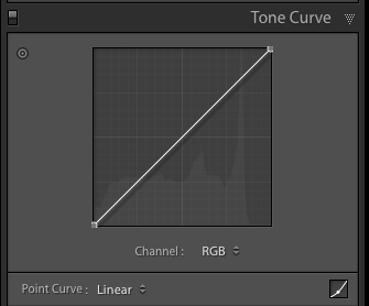
But let’s talk a little bit about how to use this tool in Lightroom, we have 3 types of tone curves , RGB and specific color curves, green, red and blue.

In the photo above you can see how the tone curves affect the photo. And the same concept applies when you are editing specific colors that can be selected from the menu below the main graph, in older versions of Lightroom, and selected at the top of the graph in newer versions of Lightroom.
You can create as many points as you like, but normally 5 is the maximum number of points needed to have good control, but we can make adjustments simpler or more complicated depending on your need.
Manipulating the tone curves is quite easy, adjusting the point in the dark region towards the top of the graph makes it lighter, and the reverse is true for the light regions of the photo. If you create a point in the center of the graph you will be controlling the middle regions of the photos, making them darker when the curve changes negatively, towards the bottom of the graph or lighter by adjusting the point positively.
The same goes for when we are adjusting the colors individually in the photos. But here instead of making the colors darker or lighter we will be transforming the colors. Adjusting the reds positively adds reds to the photos, but adjusting the curve negatively adds cyan (blues) to the photos. The same goes for the other two colors.
- Adjusting the red curve positively adds reds
- Adjusting the red curve negatively adds blues (cyan)
- Adjusting the green curve positively adds greens
- Adjusting the green curve positively adds magenta
- Adjusting the blue curve positively adds blues
- Adjusting the blue curve positively adds yellows
There are some classic curves that can be used in some situations, but none of this is a rule, they are simply starting points when adjusting your photos, and a good example of this is the famous “S”, where we reduce a little bit of dark regions of the photo and we increased the light regions a little bit.

Of course, you can create the curve shape you want, as long as it works for your photo. The important thing is to understand what the curves are doing in your photos.
After a little editing on the tone curves the photo will look like this!

During your editing process you choose not to use the tone curves, but it will always be there as a great tool.
Colors in Lightroom
Speaking of colors in Lightroom, we have a wide range of options to manipulate how the colors of your photos will look. The options go beyond adjusting the overall saturation and vibration of the photo in the basic editing tab.
In the HSL tab, we can choose not only to adjust the colors in its main parts, but also to adjust how the colors will be represented when we are editing a black and white photo . Lightroom has everything you could need to adjust, manipulate or remove colors from your photos!
Lightroom HSL tab
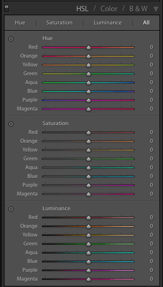
In this tab, hue, saturation and luminance adjustments are available.
- Tint (Hue), works by manipulating color, can turn green into water green or moss green depending on the setting. It works for all colors by turning the main color into its neighbor color.
- Saturation, works by making colors more vivid or less vivid (no color)
- Luminance works by making colors darker or lighter depending on the setting.
All of these can be divided by colors individually or they can all be placed on a single tab. The adjustments on this tab have an influence only on the selected colors, and on their closest neighbors. Here you can correct skin tones in the case of portraits, or the color of the sky and grass / foliage in the case of landscape photos. So we have no excuse for not correcting certain problems in our photos simply with the excuse that we have no option.

In the photo above we see how the Lightroom color tab can make a difference in the photo. Always work for balance or to highlight the colors you want to appear. The adjustments to the photos are only demonstrative of what can be done and are exaggerated to demonstrate the tool.
Split Toning
In this section you can choose a predominant color for the light areas and also a different color for the dark areas of the photo. Super simple and easy. In addition to being able to adjust the predominant color for light and dark regions, we can also adjust the saturation of these colors, as well as the balance between regions.

This section is very useful, do not underestimate it, however it will add a layer of color that does not necessarily exist in the original photo. How to use the Split toning tool is a creative decision and here it is also worth experimenting, a great advantage of the non-destructive editing of Lightroom and that if the adjustment was bad and just go back and start again.
Once the colors for the shadow and highlight regions are added, you can adjust their saturation as well as the predominance (balance) of one of them to make the whole thing a much finer and more subtle adjustment.

Details, Effects and Noise
The next tabs will take care of things like sharpness, noise, and photo vignette. And we talked about these adjustments a lot in the past article, so go back to them if you don’t remember. However, just to remember in the effects tab we have, vignette and grain, and in more current versions of Lightroom we also have the Dehaze control, or fog reduction.
The vignette serves to add dark or light edges, according to your taste. Graining will add noise to the photo, to give the photo a more vintage look.

Other than that, we still have the local adjustments that are super important for most editions, and how to use all local adjustments in Lightroom can be seen in this article here .
Presets
Presets are not a magic formula for adjusting images, just as they are not something to be left out, as many photographers think. Presets are just starting points to facilitate, save time, when editing your photos and do not take anything away from the value of your adjustments, after all you will still have to redefine the adjustment taking your photo with reference, and not the photo where the preset was created.
So try to use presets for Lightroom just as a way to start your edits so you will have complete control of what the preset is doing. Of course, in some cases, a certain preset can completely adjust your photos and make it practically ready. Having great preset alternatives is super valuable as we are looking to facilitate our edits and that’s why I put several presets for free download here on the blog, just go to this link here .
Putting everything we’ve done up to now, we can say that the edition is complete, and if you want to save it for the future it is ideal to save a preset of it. See in the video below how you can do this!
Over time you will be sure to edit your photos with much more speed and precision even without the help of any preset, but it is always good to have a direction for some type of specific editing when you don’t know where to start.
Now we just need to export or finally print your photos, and we’ll talk about that tomorrow.
If you found this article useful in any way, consider sharing it on your social networks.
Any question just leave it here in the comments or on Twitter , and don’t forget to post the results on Instagram with the hashtag #fotographiko.
And if you started with this post be sure to see others
Mastering Lightroom in 7 days
Mastering Lightroom in 7 days – Day 01 – Catalog
Mastering Lightroom in 7 days – Day 02 – Import
Mastering Lightroom in 7 days – Day 03 – Library module
Mastering Lightroom in 7 days – Day 04 – Development module
Mastering Lightroom in 7 days – Day 05 – Editing your photos
Mastering Lightroom in 7 days – Day 06 – Presets and Colors
Mastering Lightroom in 7 days – Day 07 Export or Print

