


Article content
Definitely this is as necessary subject as the one we talked about last week here, knowing how to use contrast in photography is a indispensable part of knowledge for any photographer.
And in today’s article we’re going to take a nice brush stroke on almost everything we need to know about contrast in photography. Then grab the cup of coffee, full of coffee, and let’s go to this week’s article.
Contrast in photography and contrast in art
Contrast is one of the fundamentals of art, we are not just talking about light and shadow here. We’re talking about a tool that can help you create context as well. The contrast was super important in works by classical painters such as Caravaggio and Rubens. They used it, so they could transform the space with the use of shadows, a great contrast between colours and thus achieving a great depth in their images.
The role of the contract here in this case was to affirm the intentions of the painter in order to create stronger images. By drawing a parallel with photography we can use the contrast in the same way they used in theirs paintings. If we always look for stronger shadows to create an almost three-dimensional image we will see how much the fight between light and shadows can enrich our photography.
So if you paint, draw or take pictures, think about contrast as a tool to help you tell the story and not just as a color difference.
Tonal Contrast
Tonal contrast is a type of contrast that can be very subtle or right on in your face, everything will depend on the tones you are using. The thing here is nothing more than using tones that have natural contrast on each other.
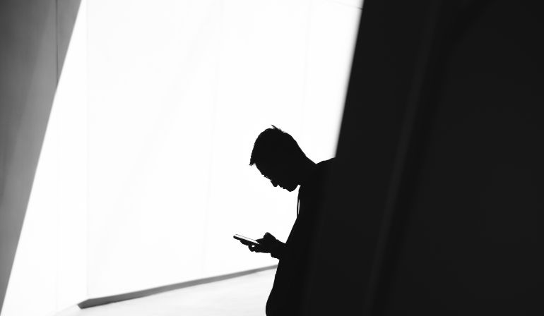
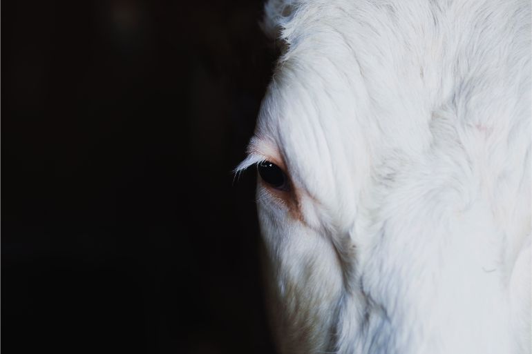
In black and white images we have two tones that are definitely opposite and create a very large tonal contrast. The idea here is to create questions insides the mind of the viewers and and try to force the person’s eyes to a specific part of the photo using colors.
As we have many more shades besides black and white and shades of gray we can also use colors that have natural contrast between them in order to create our images.
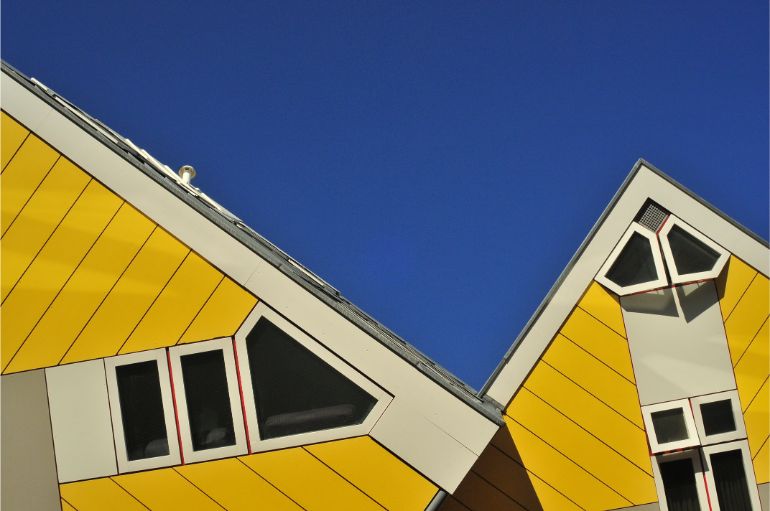
Color contrast
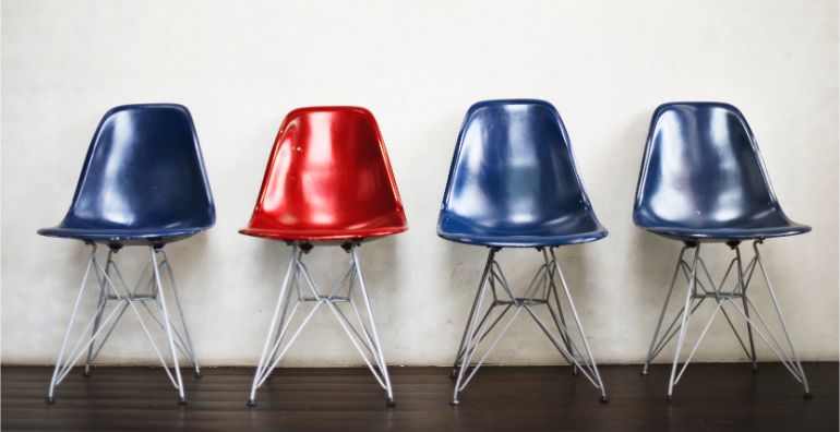
Like the tonal contrast in photography and the arts in general we also have color contrast. Which we can treat as the relationships between colors. The simplest relationship between colors is between families, warm colors and cool colors. In addition to this relationships, we also have the relationships between the colors inside the same families and also the relationship between more than 3 colors.
In this way color contrast can be almost a infinite subject in the world of color photography.
To make use of the use of colour contrast in your photograph, you must choose the colours that are photographer in a way that they not only help you tell the story of the photo, but also enrich its composition.
We have some settings to name the color contrast;
- Analogous
- Monochrome
- Complement
- Triad
These are just some names used to represent certain types of contrast, and all consist of organizing colours in a way that they talk a specific language to each other.
Always think before shooting, choose the color of the girl’s dress, the color of the background and everything else you can. So you will always have control over the color contrast of your photos.
Conceptual Contrast
This kind of contrast has nothing to do with what we’re used to. I’m talking about contrasting ideas. As if the things to be photographed were opposite to each other. Or maybe they shouldn’t “participate” in the same plan at the same time.
We use this kind of contrast when we want to put an idea in the head of the person who sees the photo. When we want to say something that cannot be contextualized and challenged.
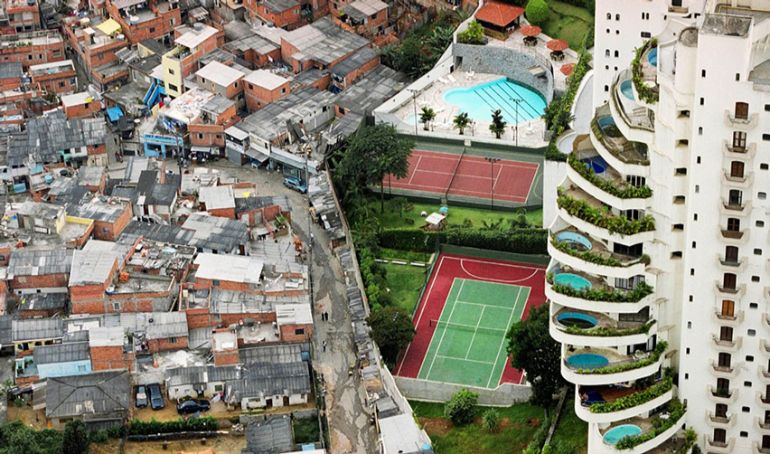
Conceptual contrast is very powerful in photography and helps to tell at least two stories at the same time. Used with care can be a great tool for telling stories of social differences.

Combining all the contrasts in the photograph
Now that you already know about the main types of contrast in photography how about trying to combine them into a photo. It can be tricky, for example to combine the conceptual contrast with the color contrast. Especially if we’re talking about street photography, but it’s not impossible.
Whenever you want a more expressive photo think of contrast as your friend, as it will give you the greatest strength on some occasions. Don’t limit yourself to just one type of contrast in your photo, try to merge them all together or use them apart. Sometimes things will work magically and sometimes they won’t.
If you liked this article share it on your social networks with the hashtag #dicadofotographiko, and if you want to ask something use the comments section!


