


Article content
Normally we don’t think about it that much, but color photography can be a huge subject, and a difficult one to digest. But before we start to chew all about colors in photography I would like to talk a little about the history behind it.
So let’s take on memory lane and take a little look at the past.
A very brief history of color photography
Photography remained in basic black and white for long years after its birth in 1839, more than 100 to be honest. It was complicated and expensive, a process for the few. So if you happened to have some extra money you could use it to practice your craft.
It was a period where major developments were made in order to achieve better prints, better chemical processes, and also optical improvements, instead of being distracted with colors.
For sure, it was a great leap on photographic technology, but people wanted more, go figure, they wanted more than shades of gray or tinted experiments.
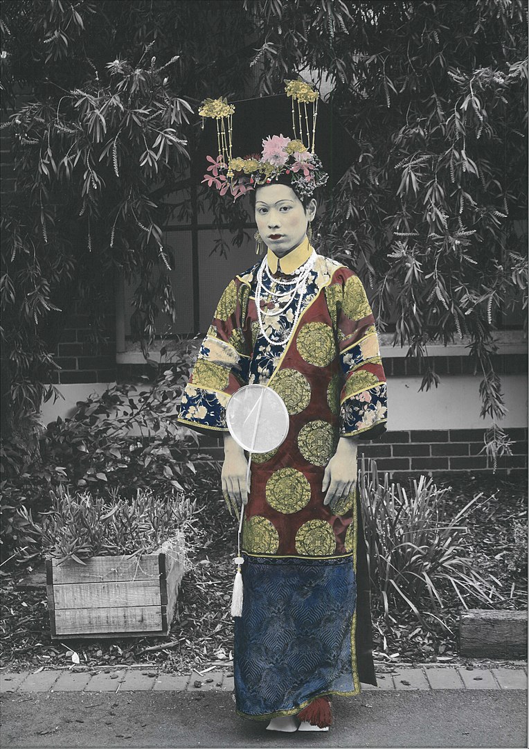
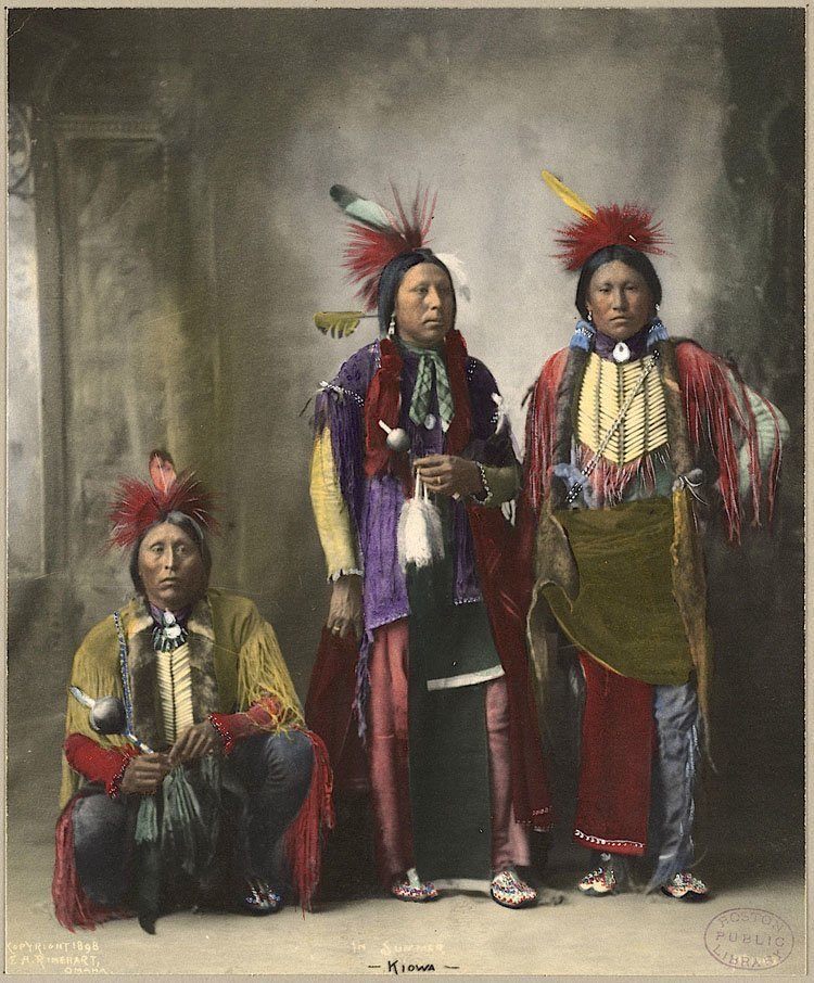
Some photographers started to experiment with hand coloring their photos, so now we humans can see the world in colors. This technique was perfected in Japan and quickly became a staple of tourist photography in the country.
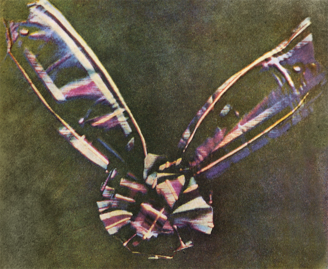
We also had a smart guy called James Clerk Maxwell working his way to color photography in 1861 with his attempt to use physics in this favor to reproduce a color image.
This is the famous Tartan Ribbon, a photo that we can say is the first-ever color photo produced with the three-color method in mind. This method is still the base for all color photography that we use today.
Another process that defined the beginning of color photography was Louis Lumière’s Autochrome, which was a more practical color process at that time. But it required longer exposure times than its contemporary black and white process, this made it very tricky to be used. But for a 1907 technology, it was acceptable, even though more advancements were needed.
And then in 1935 2 guys working at the Kodak Research Laboratories invented what we can call the new era of color photography, the Kodachrome. It was the first color film that used a subtractive color method to be successfully mass-marketed.
Kodachrome became well known for its rich warm tones and sharpness, making it a popular and preferred film for over 70 years, despite its need for complicated processing.
And of course, we have much more things to talk about the history of color photography if we dig deeper, like Agfacolor or Kodacolor that certainly changed the panorama of color photography.
Today most of us are not worried about it, since digital photography is so simple and easy to produce and to be honest a huge part of photographers out there has no idea that color TVs or computer monitors are a fairly recent addition to human history.
Color photography is more complicated than you think
Most of us just pick up our cameras and just snap the shot and later decide whether it’s going to be in color or not, this is not the best approach to this but is the most used one for sure.
The same approach to snapping color pictures is used, we tend to just click and after in Lightroom decide what kind of mood or colors to use, or accentuate, and again this is not the best approach, but the most used one.
In a previous article I put some lines on how colors are super important for our photography, but today we will see how this subject can be much more complicated than you, and I, think.
Colors Pillars
Colors are one science on its own, and we can learn a lot about photography and art in general just by studying colors alone. Not just about the overall mood of the shot, but also from a composition point of view. But before we start to pull out our hair thinking about how colors influence our perception of things, we need to get a refresher on what forms colors.
Saturation or Chroma
This one is super simple, it is how strong or dimmed that particular color is. In other words, how vivid the color will be is defined by saturation. Lots of saturation equals lots of that particular color, and the contrary is absolutely correct.
Value
As for value, also known by other names like luminance, lightness, or tone, this one is one of the most valuable, no phun intended, aspects of color and translates on how dark or bright the colors appear. And the color is always tied to a value.
Hue
This is also another simple one, which is basically the name of the colors. Green is a hue, the same goes for other colors like yellow, purple, red, etc…
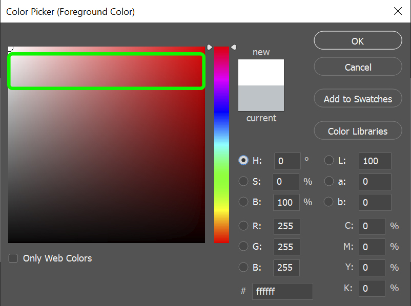
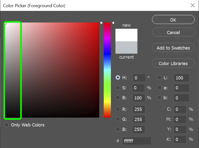
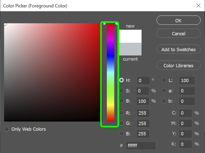
If you ever used any software to edit your images, you probably saw some form of a color picker, just like on the images above. And you probably know how to use it, at least to some extent. And it looks super simple, right. But when you start to dig deeper into it you will see that things are not as simple as we imagined.
Odd things
I say odd things because we tend to think that each parameter of color, value, saturation, and hue, works on its own to achieve the desired color. But in reality saturation and hue can completely change how we perceive value.
If you think about it, value is what makes a picture readable, so changing just the saturation or even hue, without thinking about value, can change dramatically how your picture will be perceived.
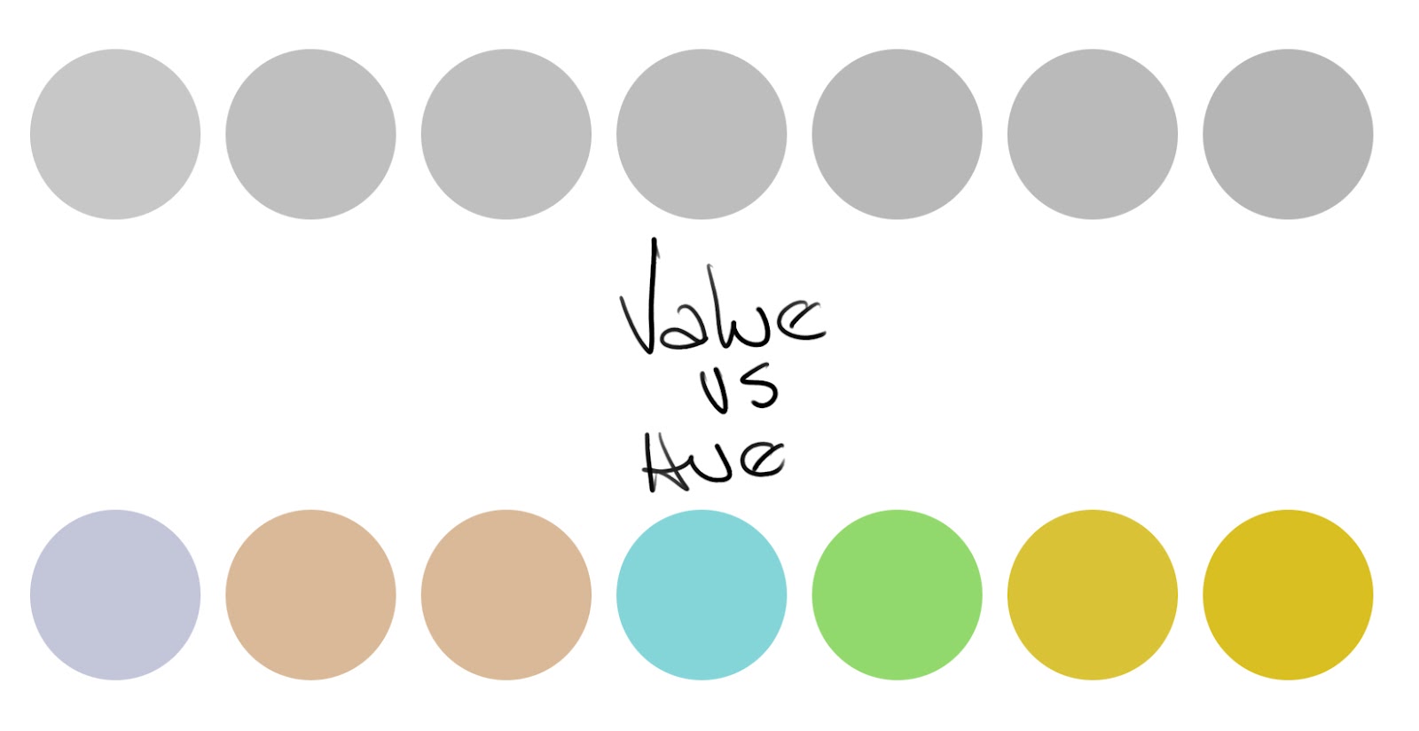
On the figure below we can see how two different hues, with the same levels of saturation, but when you transform it to grayscale they translate to completely different levels of value, just because of the changes in hue.
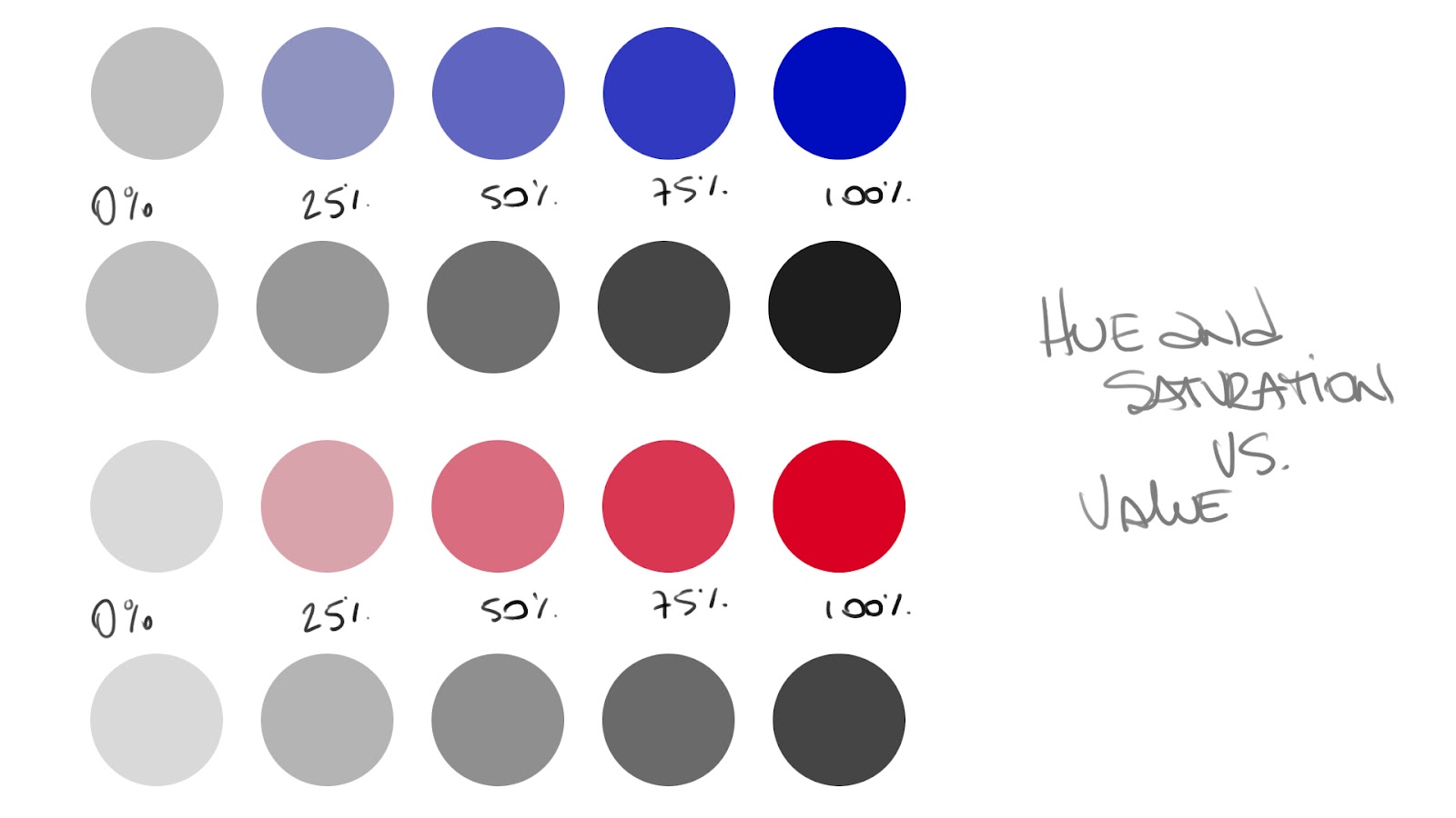
Look how a blue hue with 100% of saturation is different from a red hue with the same 100% of saturation when we translate these colors to values or tones.
Since different hues can alter the tones, how bright or dark an image is perceived, this is super important in photography not just during the composition process, where you will choose the colors that will appear at your shot, but also during the post process, when you can manipulate the appearance of captured colors.
We will face these phenomena not just when analyzing saturation + hue vs tones, but we will also see this when analyzing values (tones) vs hues. This scenario brings to the table something that can cause problems when resolving an image to just tones.
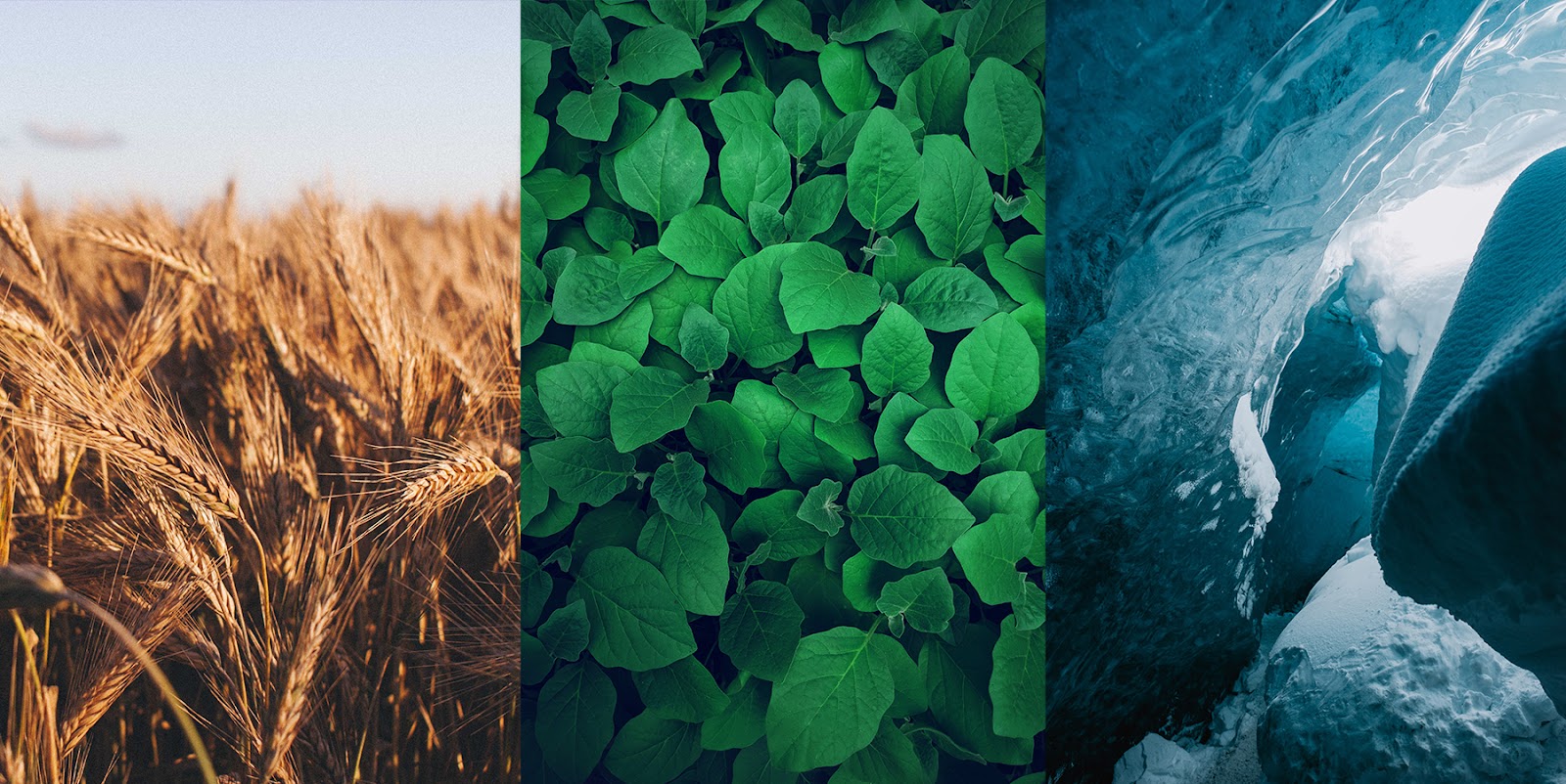
If you choose to use hues that will result in similar tones, your image will end up becoming duller and with poor separation between the objects in the shot. That’s why sometimes when you convert a picture to black and white the image starts to get confused and the objects on it start to mix too much with each other.
As we can see on the image below, even if we have somewhat different hues on the photo when it is converted to black and white, we start to lose the sense of what is what. This is happening because of the color palette choice, which has different hues, but also they have almost the same resulting value or resulting tone.

But what are colors anyway?
With all those things to be sorted out, and also other things like compositions, framing, messages, it is normal for us creatives to stay on top of the work all the time. Now imagine thinking about it and still have to deal with all these color shifts if they aren’t second nature to you. Tough job right?
But the most important question right now is: What is color anyway?
One could argue that color is present everywhere and on the other hand, we will have more skeptics who will say that color doesn’t exist. And you know what, I tend to stay on the side of the skeptics, just to name science as the way to explain some of the things we see every day.
So, color doesn’t exist, get over it. But, this doesn’t mean that we do not have something to rely on. As a matter of fact, we do have something much more interesting to study and try to solve that huge puzzle presented at the beginning of the article.
And the answer lies in electromagnetic energy, and you probably are just like my brain right now; Oh no Rix please do not go down this rabbit hole again…
And I promise my knowledge is only sufficient to show a couple of important points to our creatives about this, so I guess I will not bore you to death.
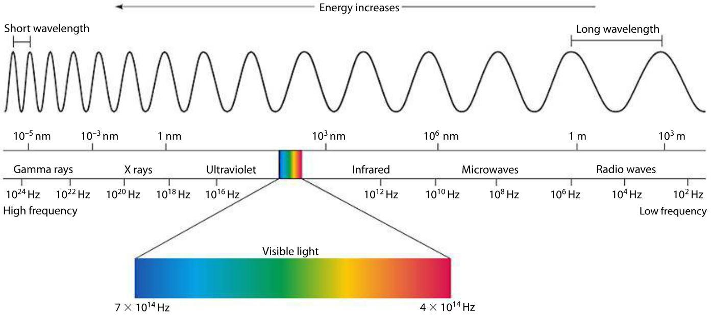
One of the components of electromagnetic energy is visible light, we have other parts there, but the most important for us is visible light.
Visible light is just a small part of the whole spectrum, and funny enough is most of the time represented like the image above, but in reality, it is just waves of energy, with no hue, no saturation thus color does not exist at this moment. Well, I think this is an oversimplified way to explain this, but this works for now.
So every time we have an electromagnetic emitter, let’s say the sun, we need a receptor to be able to read and interpret what is happening, in this case, our receptors are our eyes. And now comes the tricky, magic, trippy, call it as you like, part.
On the back part of our eyes, we have 4 kinds of photoreceptors, and they are responsible for making us see things, literally. We have some photoreceptors called rods and others called cones.
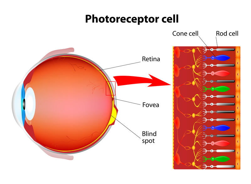
For now, we’re gonna focus more on the cone cells. We have 3 types of cone cells, those marked with the colors red, green, and blue on the image above.
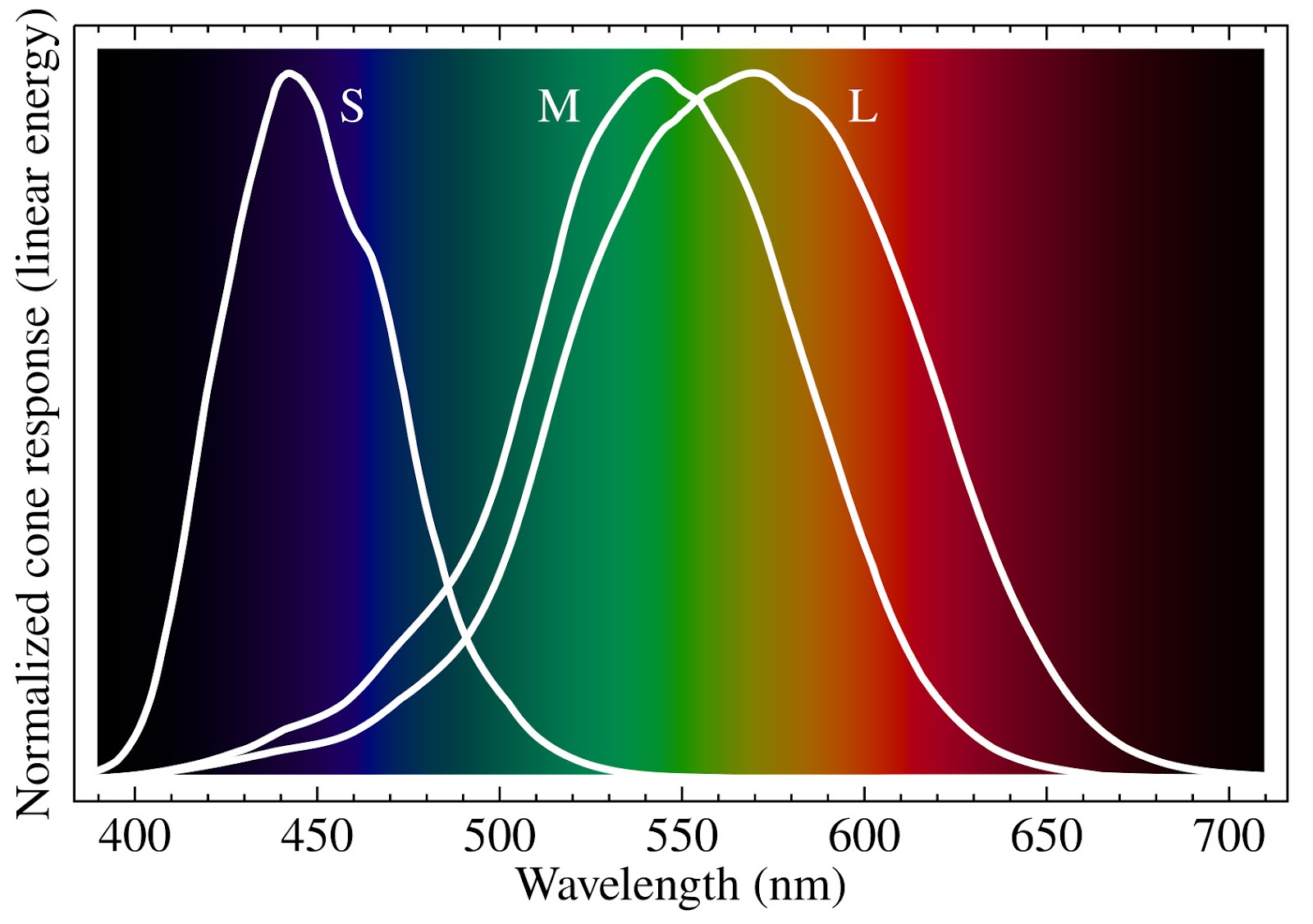
These cells are responsible for receiving and interpreting short, medium, and long wavelengths, which is pretty cool since we can somewhat relate this to our eyes.
Only when we add the eyes to the equation do we start to identify and separate colors. Well to be more exact not that separate, as we can see on the graph below, we always see a mix of at least two waves.
And one might ask why the wavelengths that humans are more sensitive to see are related to the colors we call red, greens, and blues? And the answer probably is related to our evolution as species. After all, look around you, our planet is covered with things that we named reddish, greenish, or bluish.
Funny enough, these are the colors we normally are most attracted to, and also they make the base for our color vision.
As we humans tend to put everything we are influenced by in graphs and tables, one way to exemplify what happens inside our brain when talking about colors is using the chromatic diagram like in the image below.
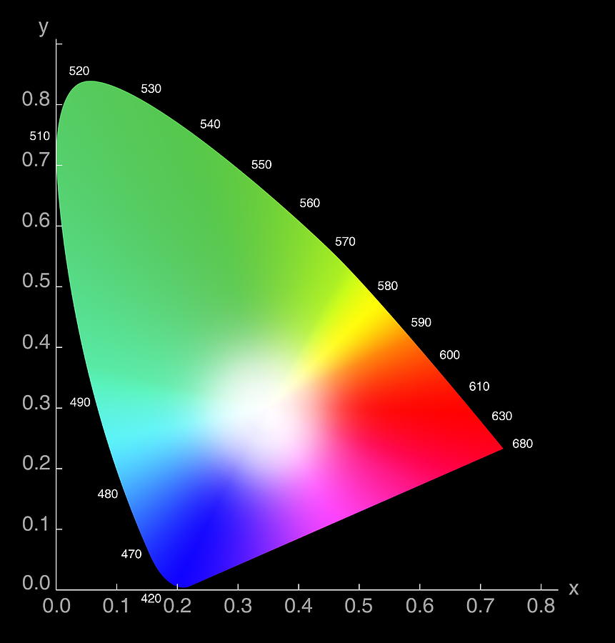
This graph above can be different depending on which species we are analyzing, flies and bees have a very different graph to explain how they perceive colors, but this is another story.
Color Spaces
One thing that we have to take into consideration when talking about colors is where we are seeing these colors, and how precise in reproducing these the media is.
This capability is called color space, which can be extremely different depending on what type of screen or paper you are seeing the image. But surely this is a huge mountain to climb since from the get-go when talking photography, we have camera sensor, software interpretation, and also viewing screens, for digital photography,
Some types of color spaces are:
- sRGB (used mainly for distributing images on the internet)
- Adobe RGB (Color space larger than sRGB used for professional photography)
- CMYK (Used mostly for printing, and here the color idea is not emitting light, instead is absorbing light and reflecting it with the right wavelength)
- ProPhoto RGB (Color space larger than Adobe RGB, very common alternative for professional photographers)
- DCI-P3 (This color space is commonly used for digital movie screenings)
- Rec.709 (Standard for high definition video for color space.)
- Rec.2020 (Evolution of the Rec.709 color space, aimed to deal with the Ultra high-resolution media.)
Depending on what color space you use, the resulting colors can vary a lot, and also be misrepresented when we factor out where we are going to see the image. However, to make our lives a little easier, it is possible to define a good rule of thumb as to when and where to use each one of those.
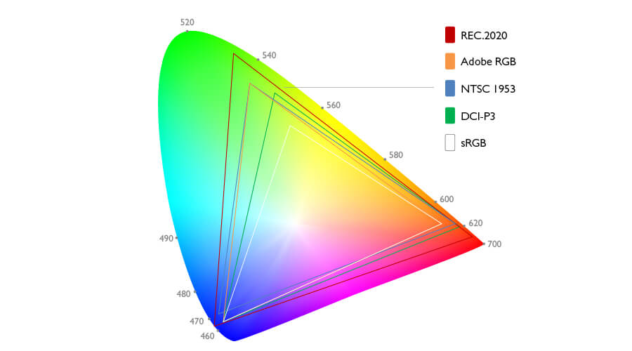
As you can see in the image above, the available colors on each color space can vary a lot and also can change your color photography. Next time you find yourself fighting with your colors, take a step back and ask yourself if you are working in a coherent color space environment.
Color spaces use
There are various ways to use, or at least plan on how to use, the color spaces. From a photographer’s point of view, I would say that this starts with your camera, adjusting the setting to be able to capture the most colors capable from your sensor. For most semi-professional or professional cameras, this will be Adobe RGB.
Also, you want to be sure that the software that you are using for the editing of your images also is capable of handling a larger color space. Lastly, I would say to save one version with the max quality and color information you can before you finish the image and finally, you can finish your image for the intended purpose.
Tricky things
Boy oh boy. Let’s take your monitor as an example. Most consumer monitors, or laptop screens, are only capable of reproducing the sRGB color space, and a good church of them are not able to reproduce 100% of such color gamut. And the same goes for your smartphone or tablet. And here the struggles start to keep you awake at night thinking about how the heck your colors keep changing from screen to screen.
So if you have a poor monitor you probably never have seen the solar your camera is capable of capturing, the same goes for your software, if you always edit in an app on your photo your color has the chance to be wacky most of the time.
The most secure idea if you do not have a good monitor is to capture your images with the largest color space possible on your camera, and then edit them to the best of your ability with the monitor you have. The minimum choice I would advise you to have is a 100% sRGB to review and edit your images since they will probably be shared on the internet, and you will be in the ballpark.
When it comes to printing, you will have to use the old and true trial and error to get where you want to be with your colors, but normally this is the normal path that things go.
Wrapping up
Colors are a different ball game, depending on your choices, equipment, the knowledge you will have different results. The idea is not just to choose the right color that will appear in your image but also to choose the right way to treat those colors.
Don’t think only in colors (Hue vs Hue), but also keep in mind the tones (levels or values) you want to achieve and how they will relate to each other in your image. DO you need more separation, don’t use similar values, try using different values, even if you need to change the hue completely.
The most important thing that you can take from this is to be aware that color is not that simple but is very fun, and it can create a different dimension to images if used right.
Let me hear your experiences with color photography in the comments below.

